Ümbe
01Lettering
Identity
Front end
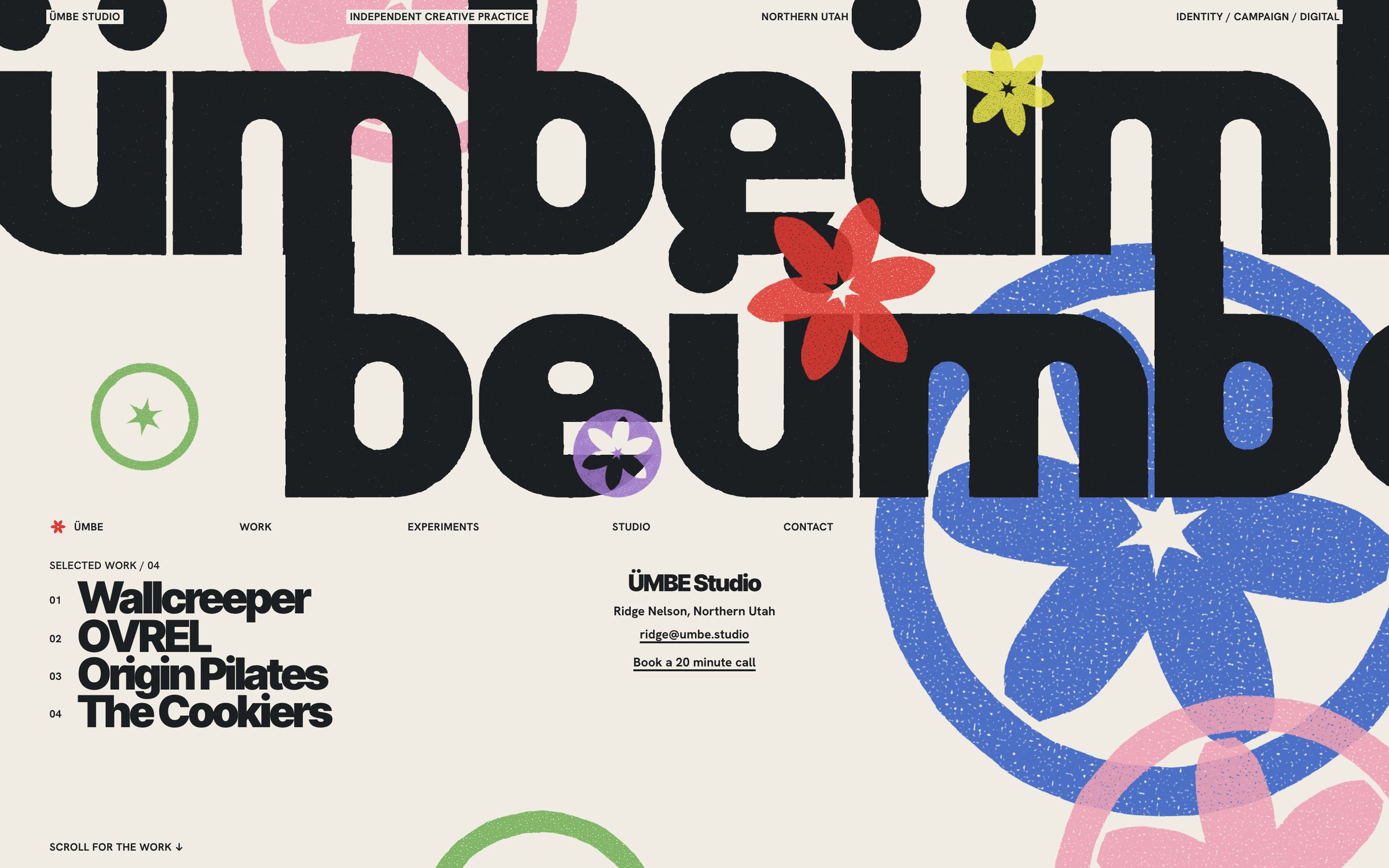
My design studio. The home page is built like a poster: a word drawn for the studio, a family of printed marks, and after it a run of two-colour sheets.
- Role
- Founder. Lettering, identity and front end, written with Claude Code.
- Status
- Live at umbe.studio. Lighthouse 100 in all four scores, mobile and desktop.
- Type
- Ümbe Slot, drawn for the studio. Inter Tight 900, Hanken Grotesk and Switzer around it.
Direction
Creme paper, slate ink, and the colour arrives as print.
The opening is paper and slate with five print colours laid over it, each one slightly out of register the way a real print lands. After the poster, every section is one two-colour pair: a full-bleed field and one figure colour, the rule I took from studying how Wall of Art prints are made.
Process
Three rounds to get from a headline to a poster.
The first hero set a clean ÜMBE in capitals and read as a website headline, so I threw it out. The marks moved from a flyer asterisk to a six-petal bloom cut from the studio's own star. The lettering became Ümbe Slot, a lowercase where every counter is one narrow slot, run on and broken across two lines.


Code
Plain HTML, CSS and a few small modules.
There is no framework, no build step and no dependency. The hero is generated SVG pasted into the page from a config file, so the lettering and the marks stay sharp at any size and the poster itself needs no script.
- 100Lighthouse, all four scores, mobile and desktop
- 0axe violations across 9 pages
- 7screen sizes checked, no horizontal overflow
- 8prints in the Ümbe series, built from the letters and marks
Motion
The marks print one colour at a time.
On load each mark lands a little out of register. Scrolling pulls the word and the marks apart, and later sections use CSS scroll timelines for stamps, slides and reveals. Reduced motion gets the finished poster and nothing moving.

Composition
Every section is a print.
Each project sits on its own field. Experiments is a wall of the Ümbe print series, framed and two colours to a sheet, with posters and films made for myself and labelled as invented.


Three decisions
-
Draw the letters
- Decision
- The name is set in Ümbe Slot, a lowercase drawn for the studio where every counter is one narrow slot.
- Why
- A studio that sells identity work should own its lettering, and it is the one thing on the page nobody else has.
-
Print it, do not decorate it
- Decision
- Marks are overprinted in colour passes, slightly out of register, instead of using gradients or shadows.
- Why
- Flat colour that overlaps reads as ink, and it stays sharp at any size.
-
Two colours to a section
- Decision
- After the poster, each section is a full-bleed field and one figure colour.
- Why
- The limit keeps a loud site readable: big type and marks take the figure colour, small text takes the ink.
At 390
On a phone the word breaks onto three lines.
The lettering re-breaks so it still fills the screen, the navigation stays on one line, and nothing is dropped. Checked at seven sizes with no console errors and no horizontal overflow.


Current state
Live at umbe.studio, with four selected projects, three more below them, and a wall of experiments, each labelled with what it is.
Not yet done: a test on a physical iPhone. Desktop WebKit passes, which is close but not the same thing.