Wallcreeper
03Strategy
Identity
Motion
A climbing chalk bag label named after a small grey bird that lives on cliffs. I took it all the way: strategy, a logo, a graphic language, packaging, a storefront and two films.
- Role
- Everything, made with Claude Code, Gemini and Upscayl.
- Status
- Self-initiated concept. The photography is AI concept imagery.
- Scope
- 52 page brand book, 48 logo files, 17 applications, 2 films.

Direction
Grey on the rock, one flash of colour.
The wallcreeper is grey so it vanishes against the rock and crimson when it opens its wings. The brand works the same way: slate twill that hides wear and shows the chalk, six colours from the cliff, and one loud lichen yellow for giant type and single details.
Strategy
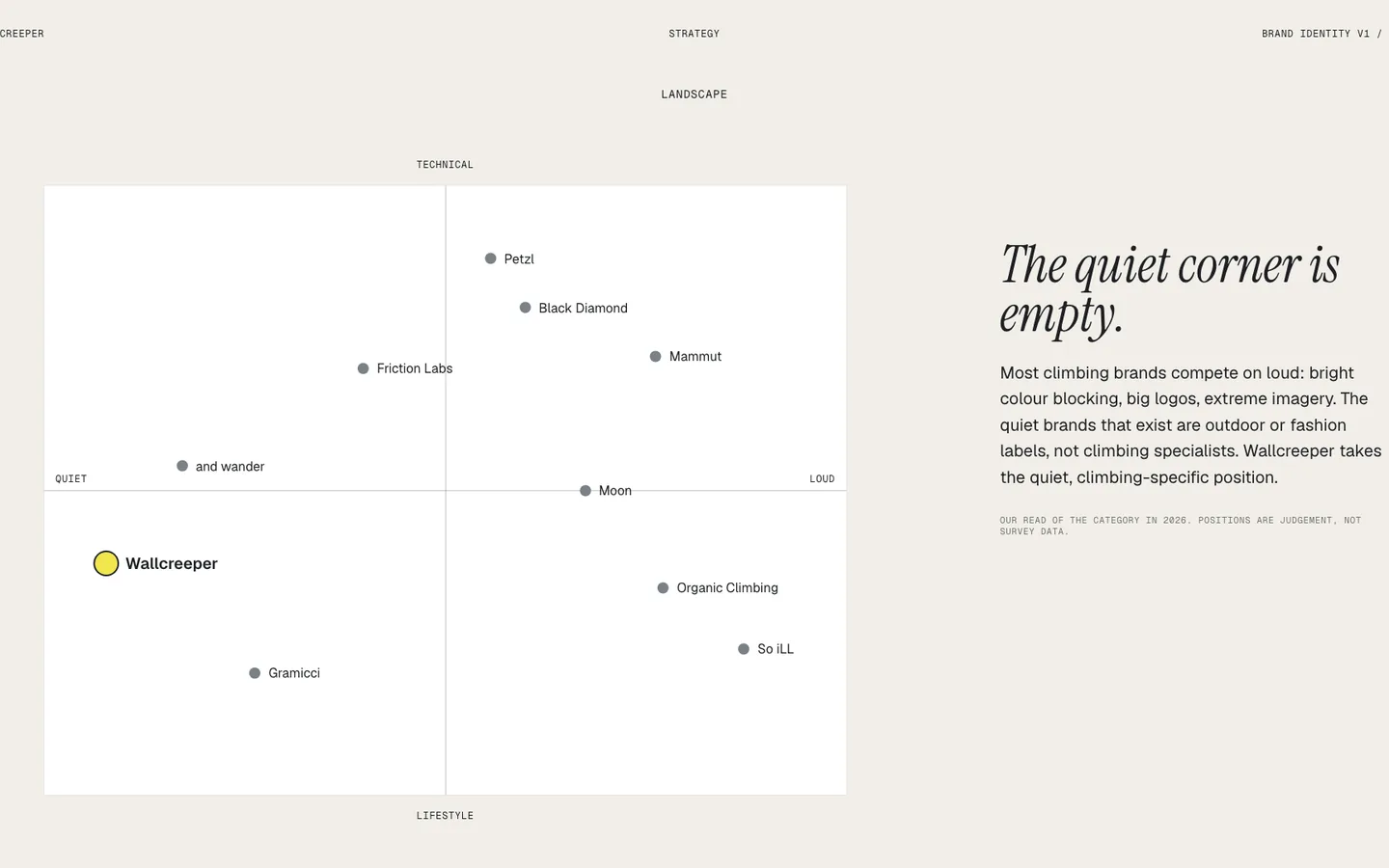
The quiet corner of climbing is empty.
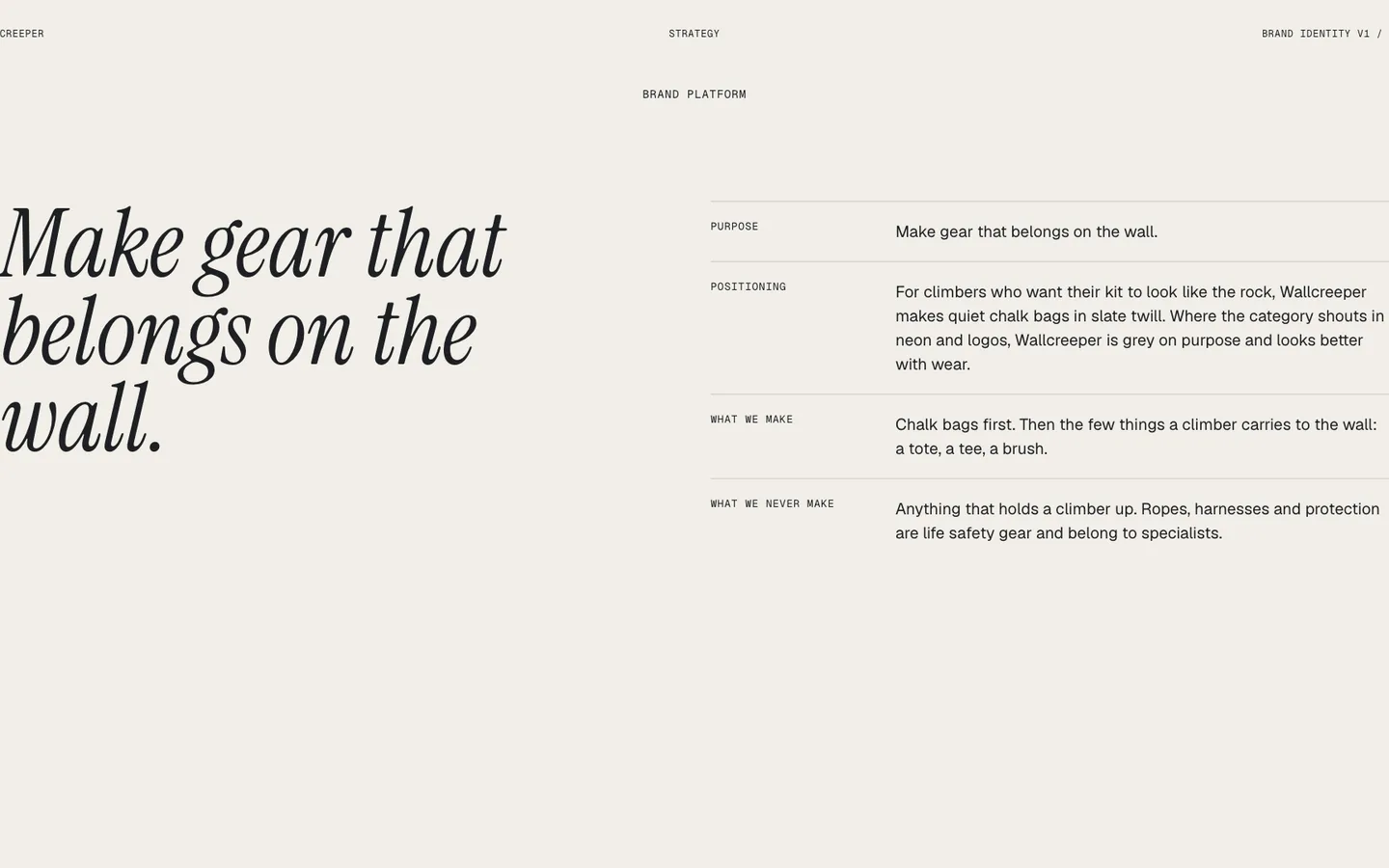
Most climbing brands compete on loud: colour blocking, big logos, extreme imagery. The quiet brands are outdoor or fashion labels. Wallcreeper takes the quiet, climbing-specific corner, with a purpose line seven words long: make gear that belongs on the wall.
The mark
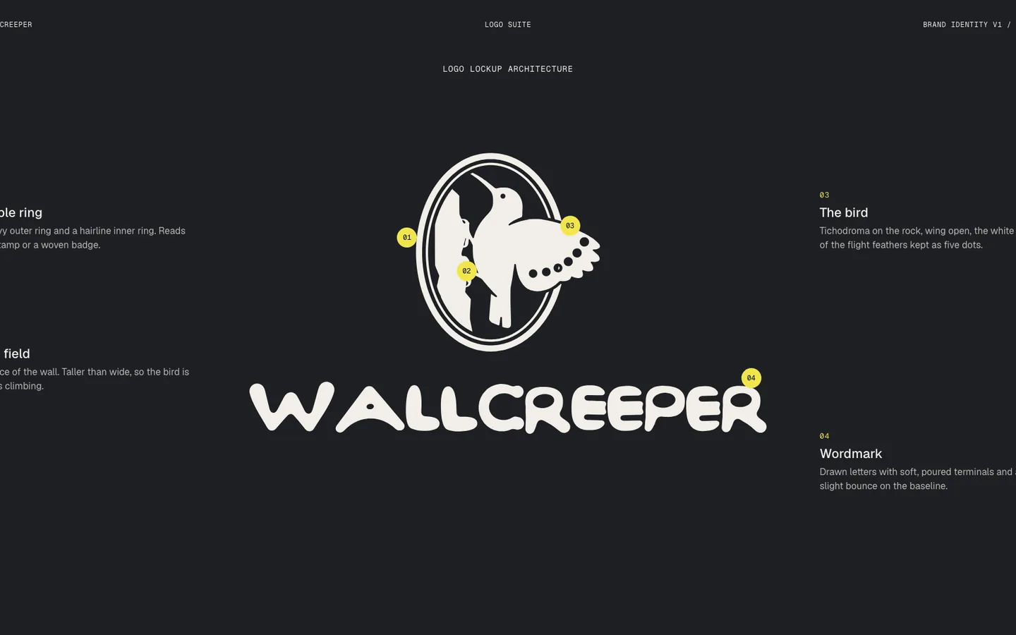
A seal the bird is always climbing in.
A heavy ring and a hairline ring hold an oval that is taller than wide. The five white spots of the flight feathers stay as five dots. The lettering is drawn, wide and soft, each letter a little off the baseline, like a climber mid-move.
Applications
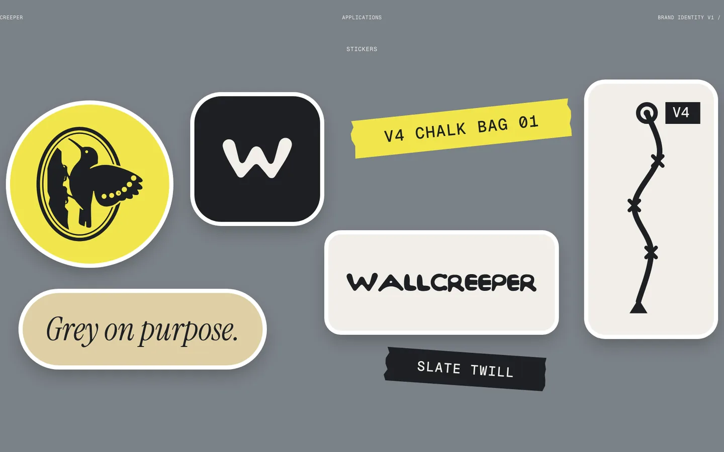
Seventeen applications, every logo placed in code.
The photographs of blank bags, cards, boxes and banners came from Gemini and were upscaled with Upscayl. The marks on them were never generated: each is the approved file, warped onto its surface, lit by the photo and printed with the grain of the fabric or paper.


Storefront
A shop that reads like a guidebook.
Route lines over the hero, one product told properly, field notes and a sign-up for the first run. Designed at 390 first and built as a responsive page.

Films
Small bird, big walls.
A 13 second identity reel and a product spot, each cut to an original score. The reel runs the whole system in order: the route dot, the wordmark, the seal, the bird, the colours, the gear.


Three decisions
-
Make the logo from the bird, not from climbing gear
- Decision
- The first round of fifteen marks was carabiners, holds and ropes, and none of it was good enough. A single figure, the wallcreeper on its rock inside a seal, tells the story in one shape.
- Why
- Climbing iconography is crowded and interchangeable. A bird is not.
-
Freeze the logo, then build around it
- Decision
- Once the seal and lettering were approved, no path was touched again. Every application places the same file, recoloured or warped onto a surface in code.
- Why
- A frozen mark is what makes a system hold across 17 applications.
-
Label the photography for what it is
- Decision
- The photographs are AI concept imagery. The case says so on the first plate and in the note, and nothing claims a product exists.
- Why
- A concept shown as a concept is still good work. Shown as a launch, it is a lie.
Brand book
Fifty-two pages, and every file.
Strategy, logo suite, colour, type, graphic language, photography, applications and digital, with a logo package of five marks in four colourways, an app icon, favicons and avatars.

Current state
A finished concept: the identity, the book, the storefront and the films are done. Wallcreeper is not a trading company and no product has been made.
Before it could launch: a trademark search on the name, dyed swatches to match the palette, and real photography to replace the concept images.